Overview
Making a field plan a farmer can read in one look
Verge plans the route a tractor drives across a field. The maths was solid. What a farmer met on screen was every control at once.
About the project
Straight and curved planning showed different controls, everything packed into one panel, and no route from the settings that matter to the many that rarely do.
There is also no best plan. Time, fuel, coverage, tracks and soil loss pull against each other, and every field trades them differently. Showing every control hands that maths to whoever is about to drive the tractor.
- Services
- Product Design
- Industry
- Agriculture and farm equipment
- Engagement
- 9 months, start to handover
- Period
- Jan 2026 – Sept 2026
1 / 3 · Setup
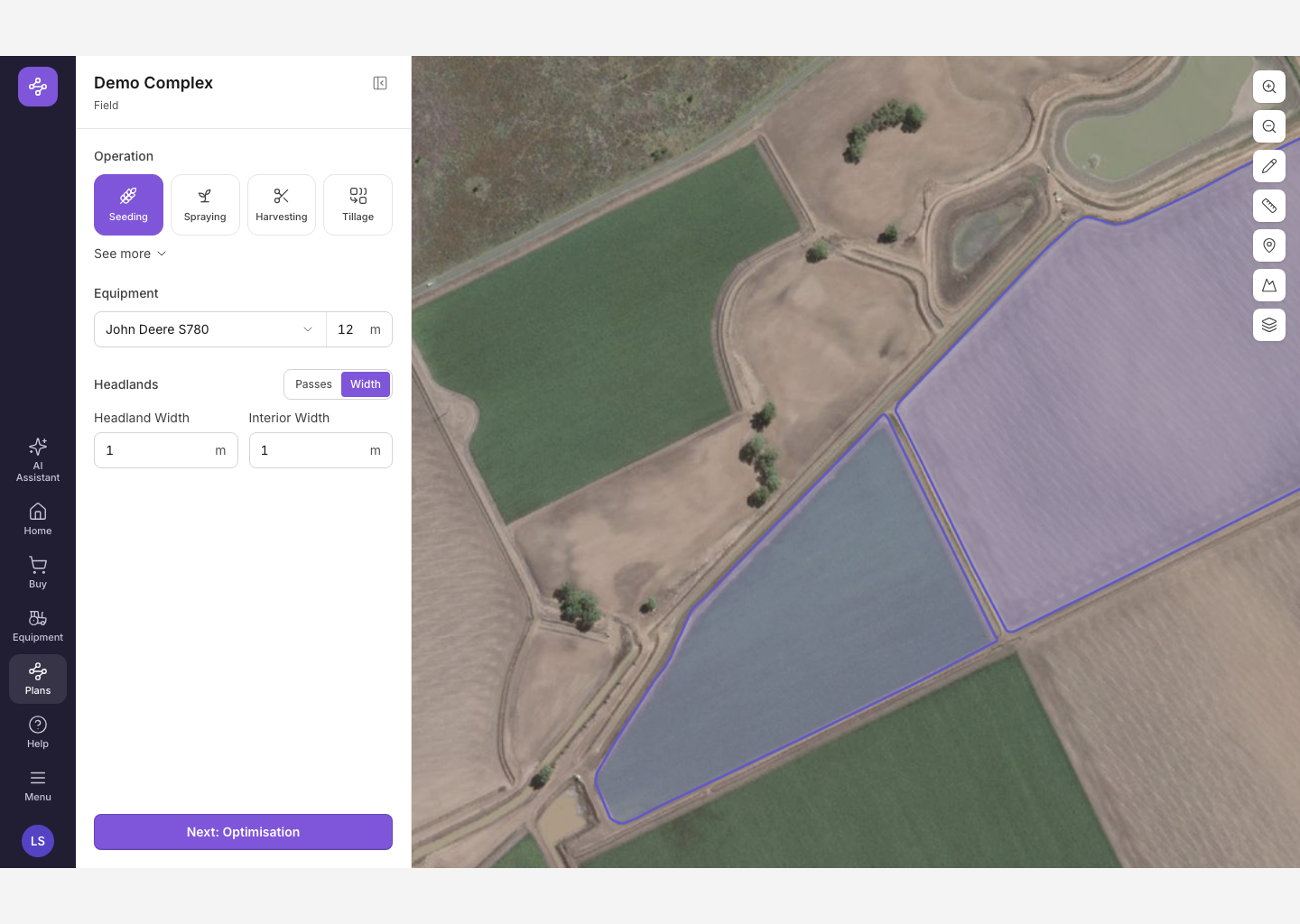
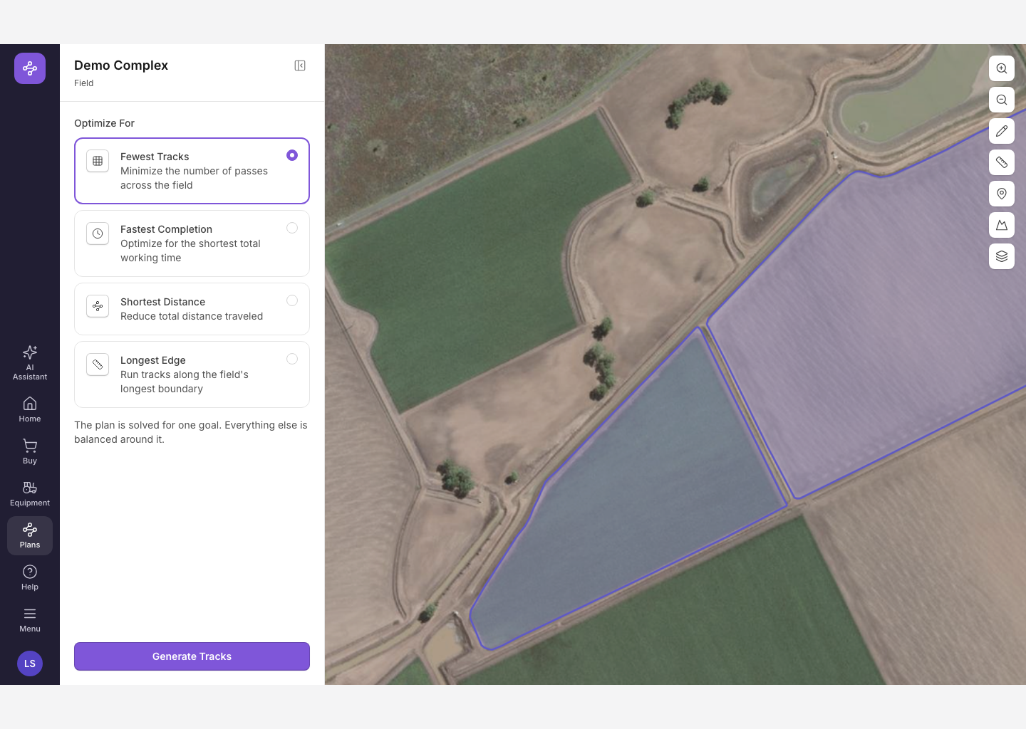
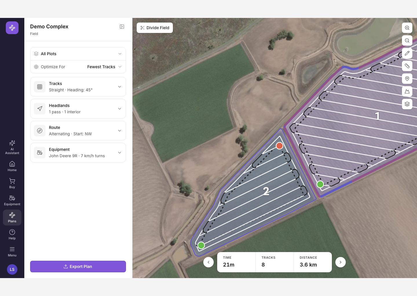
What we solved
A plan is generated by the time you arrive, balanced by default, with a few goal-based alternatives. The technical controls stay, as overrides.
Plan From got search, a preview of the field and the equipment, and a way to detach. Two saved plans can look identical and differ in ways that change the whole job.
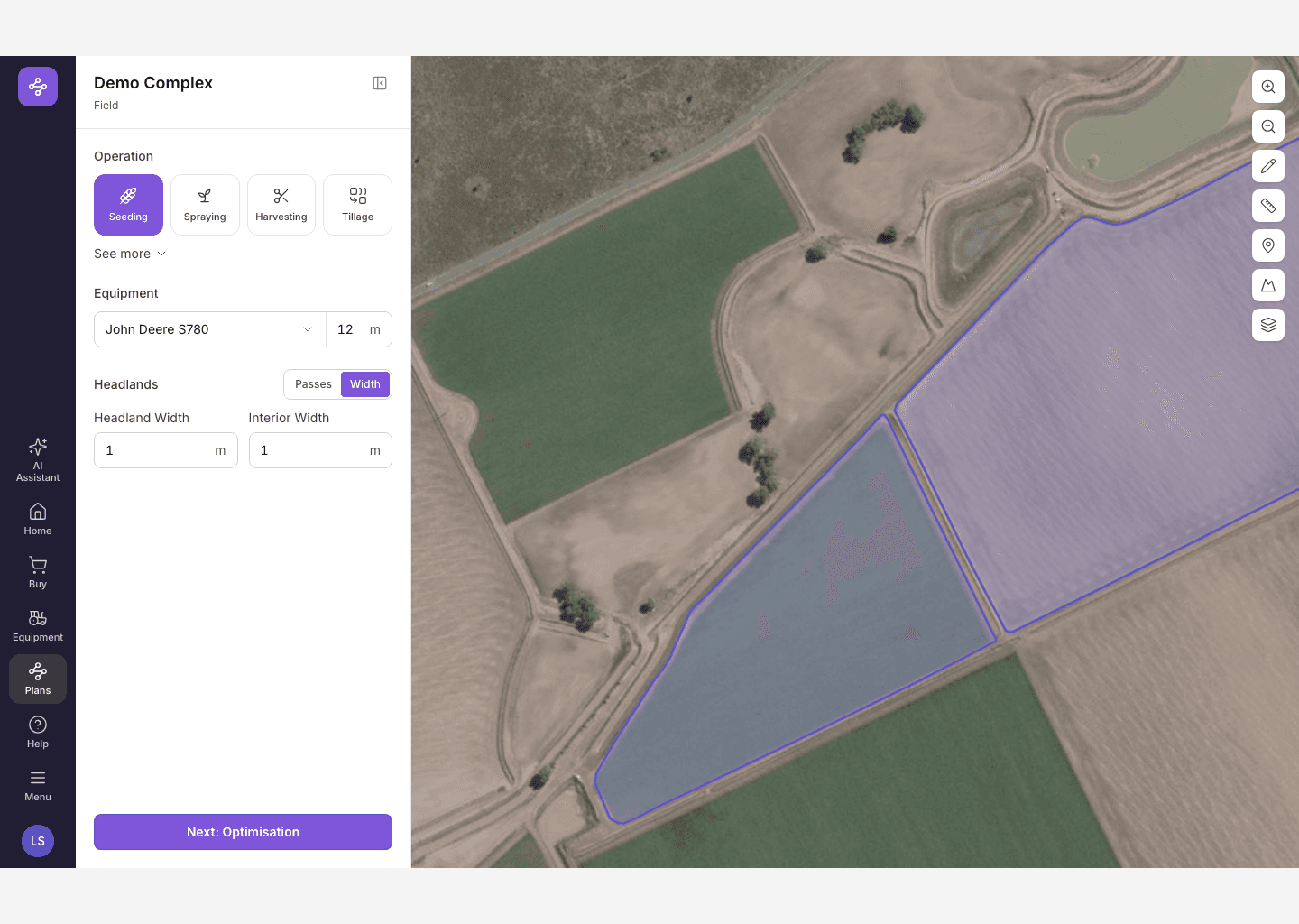
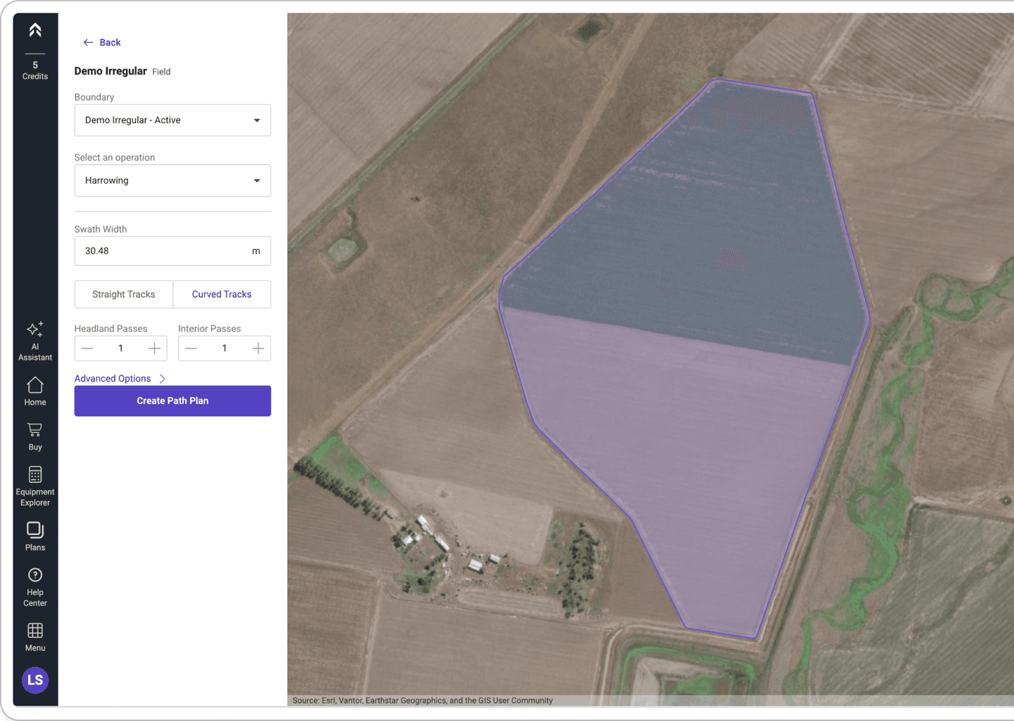
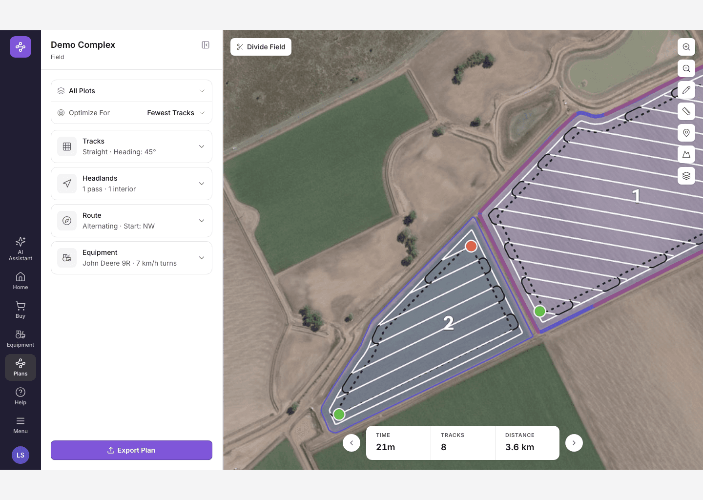
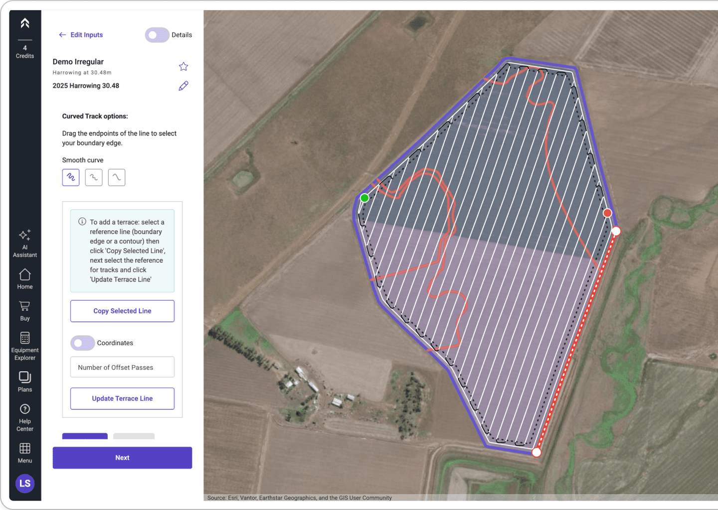
How the results page got here
Five passes, from a control panel to something readable.
A dense technical control surface
Simple setup, then everything at once. People reached a plan and could not tell what it was worth or how to change it.
Lead with a default, not analysis
The early concepts still treated results as a place to compare and tune. We moved to showing the balanced plan by default, alternatives framed as goals — fastest, least soil loss — rather than settings.
Goals early, refinements late
What defines the plan moved to the start. What you can only judge by looking at the map — heading, headlands, tram lines, boundaries — stayed with the result.
Results became somewhere you work
A plan on arrival, answering as you change it instead of sending you back to regenerate. Plan From shows its reference alongside, and disconnects once the new plan has moved on.
Contextual and progressive
Strong default, immediate result, adjustments where you can see what they do, everything else disclosed when it matters.
Where we left it
Forage harvest was the last thing through. Mowing, raking and harvesting generate together from the mowing setup, with only mowing editable in V1.
The constraints were real throughout: screens as small as 600 by 500, Angular Material underneath, and up to a minute to process a big field.
Splitting fields into zones was still open at handover — who owns the geometry, what a guidance line belongs to, and what undo means afterwards. It is written up rather than solved, which is the honest state to hand something over in.
What we built
Split UI
Split a whole field into parts, or just the inner area under one shared headland. You choose before you draw, and it stays clear whether a change hits one part or all of them.
Drawing on maps and reference lines
Draw, import, save and reuse an alignment line, or split a field with one. Drawing opens because you are doing something, not as a mode on a toolbar.
Results
One balanced plan, settings in an accordion rather than a wall, and time, tracks and distance under the map.
Plan From
Build on an existing plan, with search and a preview to tell similar ones apart. Carries the seasonal work too: mowing, raking and harvesting from one setup, with an operation selector on the map.